Monday, June 15, 2015
Tuesday, June 9, 2015
Monday, May 18, 2015
Paper version
This took me a rather long time to post because my phone was not working properly. So I used my camera to do it. The is a card for a girl. We know this because there are flowers which is a more feminine thing. The colour is baby pink, again a very feminine thing. The flowers are roses which are considered as the flowers of romance, a genre more admired by girls. Also the text is in italix which is a font more commonly used by girls.
Tuesday, May 12, 2015
Tuesday, May 5, 2015
Evaluation
Evaluation:
I am going to evaluate the card I made in publisher and the one I hand drew. It is a birthday day card for a girl. The version I drew was not that different than the one I made with publisher. They had the basic design with some words in the font, Edwardian Script ITC. inside there is a barbeque with the text next to it. Unlike the paper version which had a white back ground, the publisher version had a pink with white text boxes. The skill I should was the understanding of a card. I chose pink because it is meant for a girl. I chose the font Edwardian Script ITC because it is a very feminine font where as a boy would probably not use it. If I was to ever do this again I would have added more detail to the card such as more pictures. Over all, I am pleased with the outcome of the card.Tuesday, April 21, 2015
Cards
Inquiring Invitation Cards

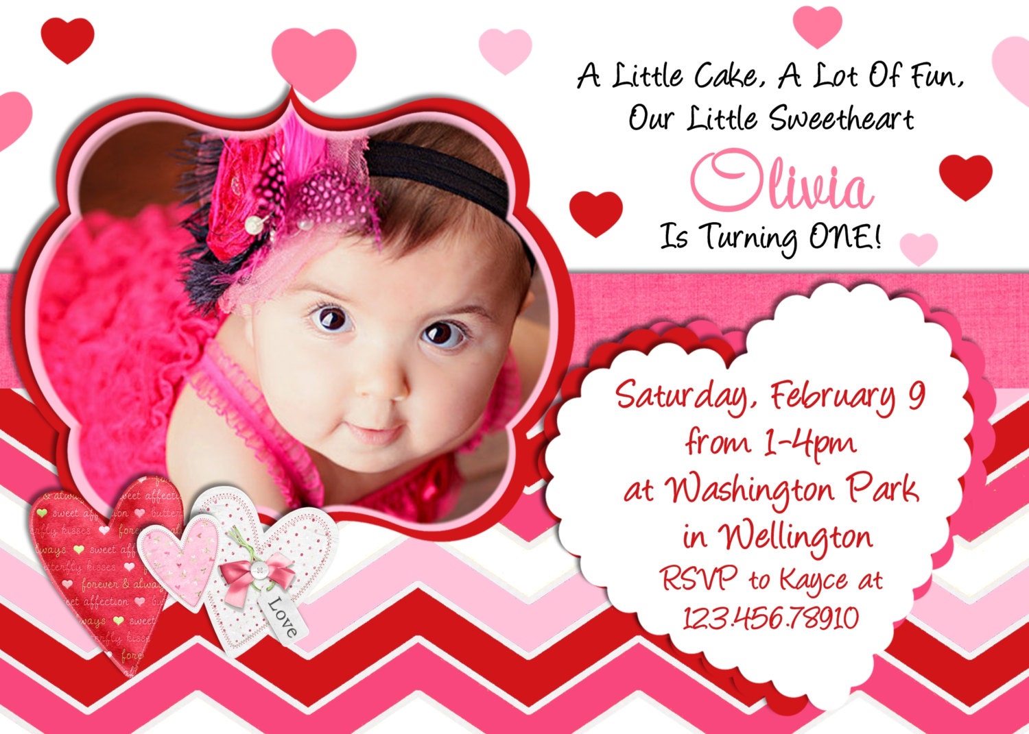
This is a birthday card meant for a toddler. The toddler's name is Olivia and she is turning one. We know this because we can see a toddler on the front. The color scheme seems to be bright girly colors such as pink. The writing is red and clear. It may not be big but it's meant to be for the parents who can read. The card has a lot going on in it with lots of patterns and hearts which draw the attention away from the writing. It may be an eye catching card but it is a little to busy.

This card is again meant for a toddler. The toddler's name is Olivia and she is turning one. The color scheme is cool colors such as green and turquoise. The layout is a green background and a turquoise border. The turquoise border has spots of a lighter shade on the cover but on the inside there are no spots. There is little writing but a lot of pictures. The pictures art all of the toddler who is having her birthday. The writing covers when and where the party is.

This is a birthday card meant for a toddler. The toddler's name is Olivia and she is turning one. We know this because we can see a toddler on the front. The color scheme seems to be bright girly colors such as pink. The writing is red and clear. It may not be big but it's meant to be for the parents who can read. The card has a lot going on in it with lots of patterns and hearts which draw the attention away from the writing. It may be an eye catching card but it is a little to busy.
This card is again meant for a toddler. The toddler's name is Olivia and she is turning one. The color scheme is cool colors such as green and turquoise. The layout is a green background and a turquoise border. The turquoise border has spots of a lighter shade on the cover but on the inside there are no spots. There is little writing but a lot of pictures. The pictures art all of the toddler who is having her birthday. The writing covers when and where the party is.
Tuesday, March 24, 2015
Tuesday, February 3, 2015
Subscribe to:
Comments (Atom)


